Remapping the world with word vectors
Posted on Sat 02 December 2017 • 10 min read
Everyone is used to the map. Most people could make a reasonable attempt at drawing one from memory (well, sort of). But what would it look like if we positioned the countries not by geographical location, but by our own perceived relationships between them? Armed with Conceptnet Numberbatch, I decided to try just that.
Contents:
- Word Vectors
- Conceptnet Numberbatch
- Countries of the world
- Countries as concept vectors
- Remapping the world
- Mapping our bias?
Word Vectors
In natural language processing, a big issue is the dimensionality of the data. Machine learning algorithms almost exclusively deal with vectors of numbers, whereas the atomic unit of natural language is the word. The natural way to encode words as feature vectors is to do what’s called one-hot encoding: make a vector with only one element 1, and the rest 0, where the position of the 1 is determined by the word. This gives us a vector as long as the dictionary, with each entry representing one word, and there is a 1 at the position of the word we are trying to represent.
There are a few problems with this approach. For one thing, these vectors are very long. Large bodies of English text contain hundreds of thousands of unique words, so each vector has to have hundreds of thousands of entries. However, a more important issue is that these vectors don’t encode any meaning. Each vector has magnitude 1, and they are all perpendicular to each other, so we lose all the relationships that we intuitively know words carry.
Word vectors are an attempt at a solution to both of these problems. The idea is to use an algorithm to learn a set of numbers that are unique to each word, and such that “similar” words have vectors that are “close to” each other. Here we consider words to be similar if they are often used in the same context, and we compare vectors by the angle between them (cosine similarity). There are various implementations of this idea, including Stanford’s GloVe, two flavours of Google’s word2vec, and Facebook’s fastText. These approaches are very successful in their aims, even learning to encode abstract relationships between words, as demonstrated by this 2d projection of the GloVe vectors:
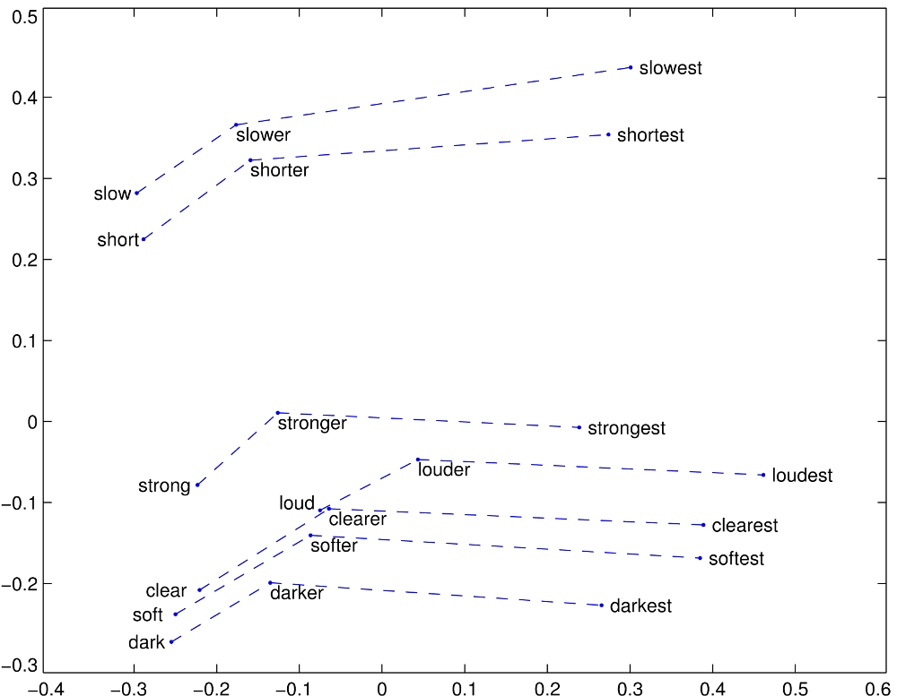
It’s worth mentioning that these vectors are the result of unsupervised learning: nobody told the algorithms that loud should be to loudest as strong is to strongest. The relationships are learned purely from the contexts that the words are used in.
There are pre-trained vectors from all these implementations available online to download, and if you have a lot of data it’s also possible to train your own. If you do decide to make your own word vectors, make sure you fit in with the cool kids by giving them a name with weird capitalization.
Conceptnet Numberbatch
The popular word vector sets are mostly just that: word vectors. But what about singular concepts whose names happen to contain a space? If we split our text into individual words, it is difficult to reconstruct these concepts. The team at ConceptNet have done just that, combining several existing word vector sets and augmenting them with their own semantic network (a mapping of how concepts relate to each other). They also attempt to purposely de-bias their vectors so as not to encode relationships that are racist, sexist, etc. Their “concept vectors” are humorously called Conceptnet Numberbatch. For this post I used the English-only subset, which contains 416,410 vectors.
By using the Conceptnet Numberbatch vectors we can compare not just words, but also concepts with each other for similarity. Of course, some words have a double meaning, and one similarity measure will never capture this. As an example, I sorted the concept vectors for similarity to “orange”. The top few are mostly various subtypes of the citrus fruit, but at number 9 we get “yellowred”, which is clearly related to the color:
Top 20 most similar concepts to "orange":
   1. orange_tree          Similarity: 0.96476
   2. orange_river         Similarity: 0.94728
   3. sweet_orange         Similarity: 0.93845
   4. citrus_sinensis      Similarity: 0.93466
   5. valencia_orange      Similarity: 0.92221
   6. sour_orange          Similarity: 0.91260
   7. citrus_aurantium     Similarity: 0.88945
   8. bitter_orange        Similarity: 0.88880
   9. yellowred            Similarity: 0.86298
  10. seville_orange       Similarity: 0.85275
  11. temple_orange        Similarity: 0.85226
  12. bigarade             Similarity: 0.84110
  13. iyokan               Similarity: 0.83425
  14. orangish             Similarity: 0.83299
  15. secondary_colour     Similarity: 0.82235
  16. tropaeolin           Similarity: 0.79860
  17. orangelo             Similarity: 0.79785
  18. orange_coloured      Similarity: 0.77347
  19. tangor               Similarity: 0.77011
  20. orangequat           Similarity: 0.76962
There are ways around this issue too, for example by including word senses in the vectors, but this is overkill for our purposes.
Curious about my homeland, I tried out the same thing with “Canada”. Hilariously, both “America’s hat” and “Soviet Canuckistan” make the top 20:
Top 20 most similar concepts to "canada":
   1. canada_west          Similarity: 0.97635
   2. great_white_north    Similarity: 0.96604
   3. laurentian_highlands Similarity: 0.96598
   4. arctic_archipelago   Similarity: 0.96598
   5. hydrofield           Similarity: 0.96262
   6. ookpik               Similarity: 0.96262
   7. canada_east          Similarity: 0.96223
   8. central_provinces    Similarity: 0.95273
   9. canadianist          Similarity: 0.94114
  10. central_canada       Similarity: 0.94038
  11. upper_canada         Similarity: 0.93867
  12. lower_canada         Similarity: 0.93571
  13. canadian_shield      Similarity: 0.93504
  14. canadas              Similarity: 0.92199
  15. america's_hat        Similarity: 0.91242
  16. hudson_bay           Similarity: 0.91084
  17. canadian_studies     Similarity: 0.90770
  18. in_north_america     Similarity: 0.90715
  19. soviet_canuckistan   Similarity: 0.90083
  20. eastern_canada       Similarity: 0.90079
Note that the average similarity score in Canada’s top 20 is much higher than in orange’s. This is likely because “orange” is used in a more wide variety of contexts than “Canada”, which dilutes its similarity to any given concept.
Countries of the world
It turns out that getting standardized data about the countries of the world is surprisingly tricky. There are various definitions of attributes, character encoding issues, countries not recognizing each other, etc. Luckily, Mohammed Le Doze has painstakingly compiled a high quality set of country data in various formats, allowing me to offload responsibility for any political sensitivities.
As a starting point, we can plot the locations of the countries as we expect to see them. The positions are given in latitude and longitude, but through the magic of map projections (conveniently provided in this code snippet from OpenStreetMap), we can plot the positions on a flat plane. I creatively decided to represent the countries as blobs with size approximately related to the land area of the country, and immediately gained respect for people who are actually good at making maps:
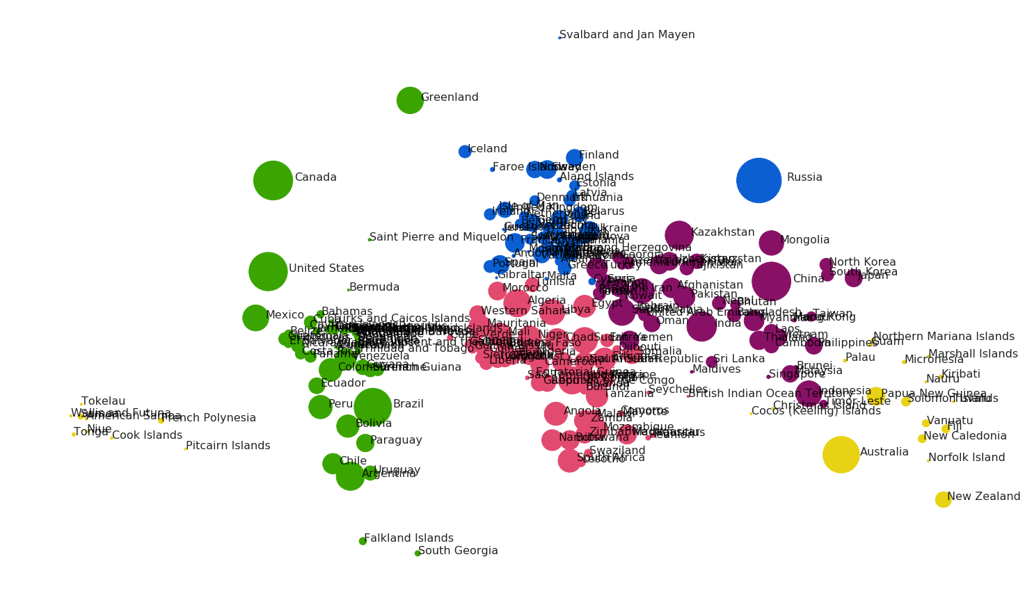
Nailed it.
Countries as concept vectors
The countries dataset provides us with a “common English name” per country. We use this name to associate a concept vector to each country in the set, to the extent possible (some countries, such as French Southern and Antarctic Islands, and British Indian Ocean Territory, were not in Conceptnet Numberbatch. Sorry about that.).
Considering countries as concepts with associated vectors reveals some interesting structure. Using hierarchical clustering, we can sort the countries such that more similar countries are next to each other. Plotting the similarities as a heatmap visualizes the clusters of countries that have especially high similarity to each other (and it looks really cool):
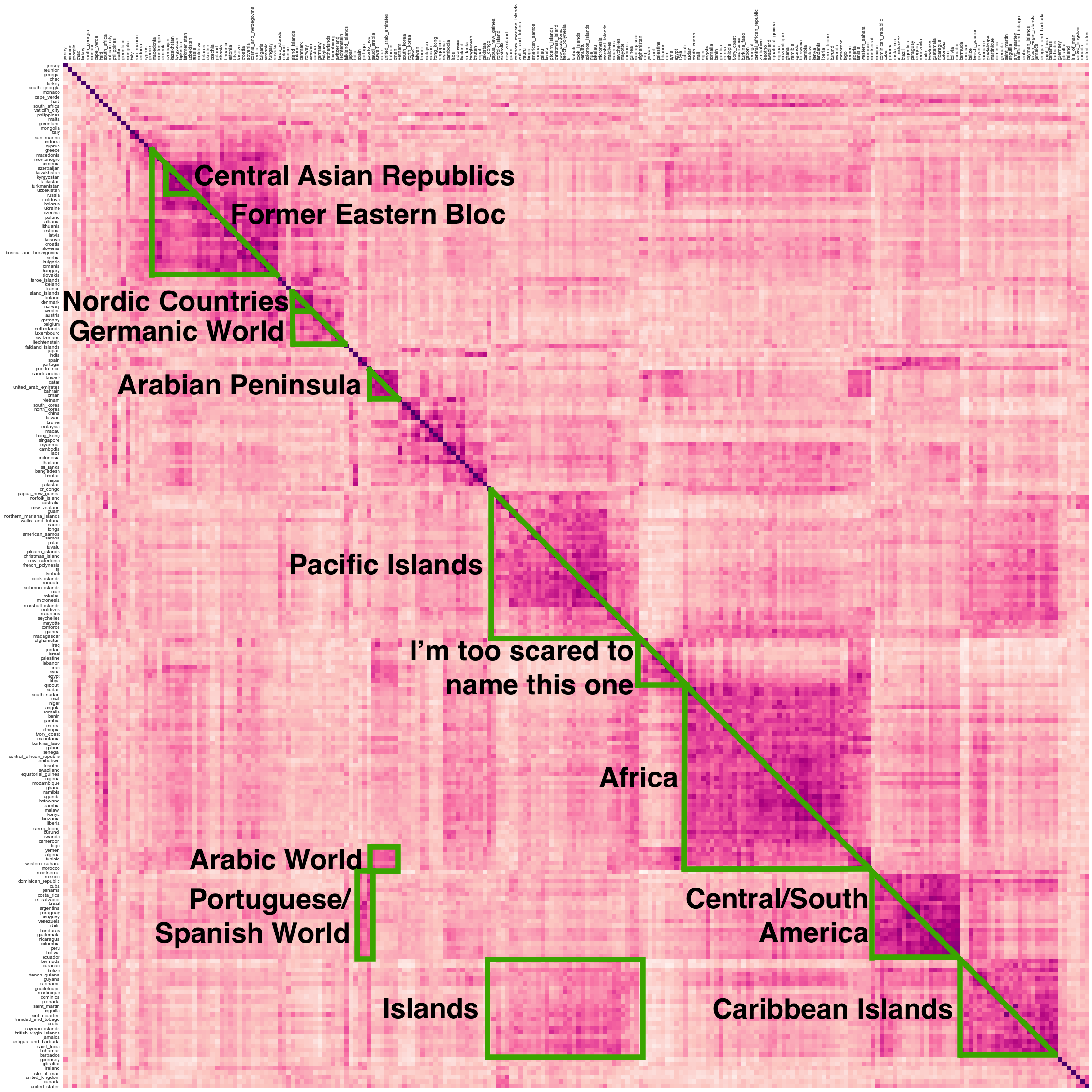
I realize this is big and hard to read; you can click on the image to get the full sized one where the country names are actually legible.
The squares along the diagonal are the main clusters of similar countries which were identified by the clustering algorithm. I’ve tried to give semi-appropriate names to a few of them. We see for example the Arabian Peninsula (Saudi Arabia, Kuwait, Qatar, the UAE, Bahrain, and Oman), groups of nearby islands, and the Group Which Shall Not Be Named (Iraq, Jordan, Israel, Palestine, Lebanon, Iran, Syria, Egypt, and Libya). Thanks to our use of hierarchical clustering, we also see groups with substructure, like the Germanic countries, which visibly include the Nordic countries and BeNeLux.
On the off-diagonal we also see some structure. These are mostly primary clusters which have strong inter-group relationships. I’ve labeled three such groups: the Pacific and Caribbean Islands are quite strongly associated with each other, Spain/Portugal are similar to their (mainly South American) colonies, and many of the Arabic-speaking countries are also associated with each other.
It’s interesting to note that the primary clusters seem to be mostly determined by geographical proximity, while the off-diagonal groups seem to be more influenced by culture/language.
Because the entire world is a bit hard to take in all at once, we will zoom in on Europe for a little bit. We end up with:

Now it seems that the Germanic world is much less pronounced, the Åland Islands have been split out from the rest of the Nordics, and the Channel Islands are basically separated entirely from the rest. Sorry about that, island nations.
Remapping the world
While the heatmaps are interesting, we started out on a mission to remap the world, and that’s what we’re going to do. To figure out the new placement of the countries, we visualize them as a network graph, simulated with d3.js. The nodes are our country blobs, and they will be connected by springy edges. The edges act with a force on the nodes, pulling more similar countries closer together, and pushing dissimilar ones apart. By initializing the simulation with the countries in their original position as plotted on the map above, we hope to end up with a layout that reflects geography as much as possible, so that we’re sure any major changes are the result of taking into account the concept vector similarity. We’ll begin with Europe, and connect each country to its top 10 most similar neighbors (to keep the complexity of the simulation down). Thanks to the magic of d3, we can make the map interactive, so if you aren’t happy with where your country ended up, you can try to drag it somewhere else and see which other countries get pulled along too.
Tip: If you’re on mobile, this looks nicer in landscape mode!
Now we’re talking! The simulation isn’t totally deterministic, so you might see something different, but when I run it I see the Faroes and Iceland get pulled into the interior of Northern Europe thanks to strong connections with the (rest of the) Nordics. The UK moves even further outside mainland Europe. France gains Ireland as a neighbour, but not because of any particularly strong relationship. Rather, Ireland has connections to fellow island nations Iceland (North), Malta (South), and the UK (West), so in balancing these it just happens to end up near France. The Vatican is ejected from mainland Europe due to its surprisingly weak connection to Italy. The Baltics move southeast to be closer to the former Yugoslav countries, which also causes Poland to be pulled south of Austria.
It’s extremely addicting to play with this simulation and imagine the alternate histories that could have resulted. The Vatican Armada? The Polish-Faroese Empire? Delicious Irish cuisine? We will never know.
Just like with the heatmaps, the network graph for the entire world is a bit overwhelming. We simplify the simulation further by connecting each country to only its top 3 neighbors, and make it a bit taller to give them more room to spread out (feel free to drag them apart yourself to get an even better view):
Dragging the countries around gives a good feel for who is connected to who. It’s particularly interesting when countries from different continents are closely connected. Portugal and Spain are pulled into the midst of their South American colonies, which form an unusually rigid block. The US finds an unlikely neighbor in Georgia (undoubtedly caused by the US state of the same name). The Anglosphere makes its first appearance, linking the US, Canada, the UK, Australia, and New Zealand (and, dare I say, Ireland). Turkey and Central Asia are disconnected from the rest of Asia, preferring the company of Russia. Canada and the US decouple from the rest of the Americas. Chad is kept at a distance from the rest of Africa, probably because of its common usage as an English name diluting the strength of its connections (the “orange” effect), an issue which also plagues Réunion. The Falklands gain great strategic importance, forming a sole link between the Pacific Islands and the Caribbean.
Surprisingly, the entire world seems to remain connected (even if the connecting edges are so weak as to not be visible). Our simulation of so few connections made it possible for 3 or 4 countries to form an exclusive block, disconnected from the rest of the world, but as far as I can tell this did not happen.
Mapping our bias?
We have spent quite some time considering the new (and old) groupings that show up when we consider the countries as concept vectors. However, it’s also important to consider what is not present in the data, and how this may reveal underlying confounding factors.
Although a loosely-grouped Anglosphere formed in the world network graph, the relative strengths of the connections were largely weak enough to not show up in the clustering we performed to create the heat map. Conversely, Africa appeared in the heatmap as one giant block, despite great diversity across the continent (Somalia, Tunisia, and Zimbabwe in the same group?).
My hypothesis is that this is a result of using only the English subset of Conceptnet Numberbatch’s concept vectors. We humans have a tendency to see differences between members of our “own group” (whatever that means), while seeing other groups as one cohesive unit. Wikipedia tells me this concept is known as out-group homogeneity, which can lead to stereotyping. In the English concept vectors (which were trained on English text gathered from the Internet), the Anglosphere countries aren’t frequently used in the exact same context, because they are more often perceived as the in-group by people who are speaking English. This (and not Brexit) would also explain the UK being pushed out of Europe and relatively far from Ireland in the Europe network graph. All of this happens in spite of ConceptNet actively working to remove bias from their vectors, showing just how tricky this issue really is.
It would be interesting to confirm this hypothesis by trying this experiment out with other language vectors, but this post is already long enough, so I will leave that for future exploration. For now, suffice it to say that unexamined factors in your data may lead to unexpected results. If you find yourself making sweeping generalizations or casually reporting on “Soviet Canuckistan”, it may be time to reevaluate your assumptions.
Did you find any other interesting (missing) connections? Could I have improved the graphs (this is my first forray into d3)? Let me know below!